I’m a big fan of the Office 2007 style tooltips and one of the areas where I feel .NET lets me down a little is in the ToolTip department.
Here’s the default .NET ToolTip:

Now take a look at the following ToolTips:
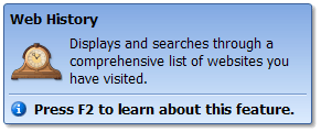

Not only do they look much better, but they also provide some very needed features.
- Each ToolTip can be defined with an access key, F2 in the above samples, which provides you with the ability to give extra functionality for each ToolTip.
- Each ToolTip can be given a specific “disabled” message that you can define to let your users know why a button is disabled and what the next step would be to get it enabled. In the regular ToolTips, if a control is disabled then no ToolTip is shown.
The best part about the above ToolTips is that you can add this functionality to your program for free thanks to SKYBOUND. Their free .NET component is called VisualTips and it’s a breeze to implement. They also have a bunch of other free components to help you spruce up your application so definitely check them out.
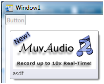
On a side note, WPF (.NET 3.0) provides similar functionality out of the box and here is a xaml sample (not the coolest, but can be beefed up easily):
<Button x:Name=”btn1″ HorizontalAlignment=”Left” VerticalAlignment=”Top” Content=”Button” IsEnabled=”False” ToolTipService.ShowOnDisabled=”True” >
<Button.ToolTip>
<ToolTip x:Name=”buttonToolTip”>
<StackPanel>
<Image Source=”http://www.muvaudio.com/banner/muv2banner170x77.png” />
<TextBlock x:Name=”buttonToolTipText” Text=”This is a sample tooltip in WPF”/>
</StackPanel>
</ToolTip>
</Button.ToolTip>
</Button>
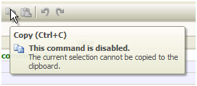
The ToolTipService.ShowOnDisabled=”True”
attribute makes it so the ToolTip is displayed whether or not the control it is attached to is enabled or disabled. In the below screenshot, the control is disabled and you can see the sample WPF ToolTip.
ToolTips are an important part of the usability of any application, especially when it helps remove the need of requiring the user to read the manual before beginning use of your application.